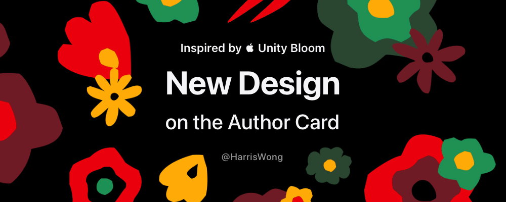
Hey guys! I'm so excited to write this blog post, which is my first time trying to write a whole blog post in English. In this post, I want to share my new ideas on designing the Author Card component on the blog website inspired by the Unity Bloom theme wallpaper from Apple's official website.
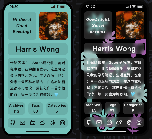
Take a look at the comparison of the before and after Author Card designs first:
H1Intro
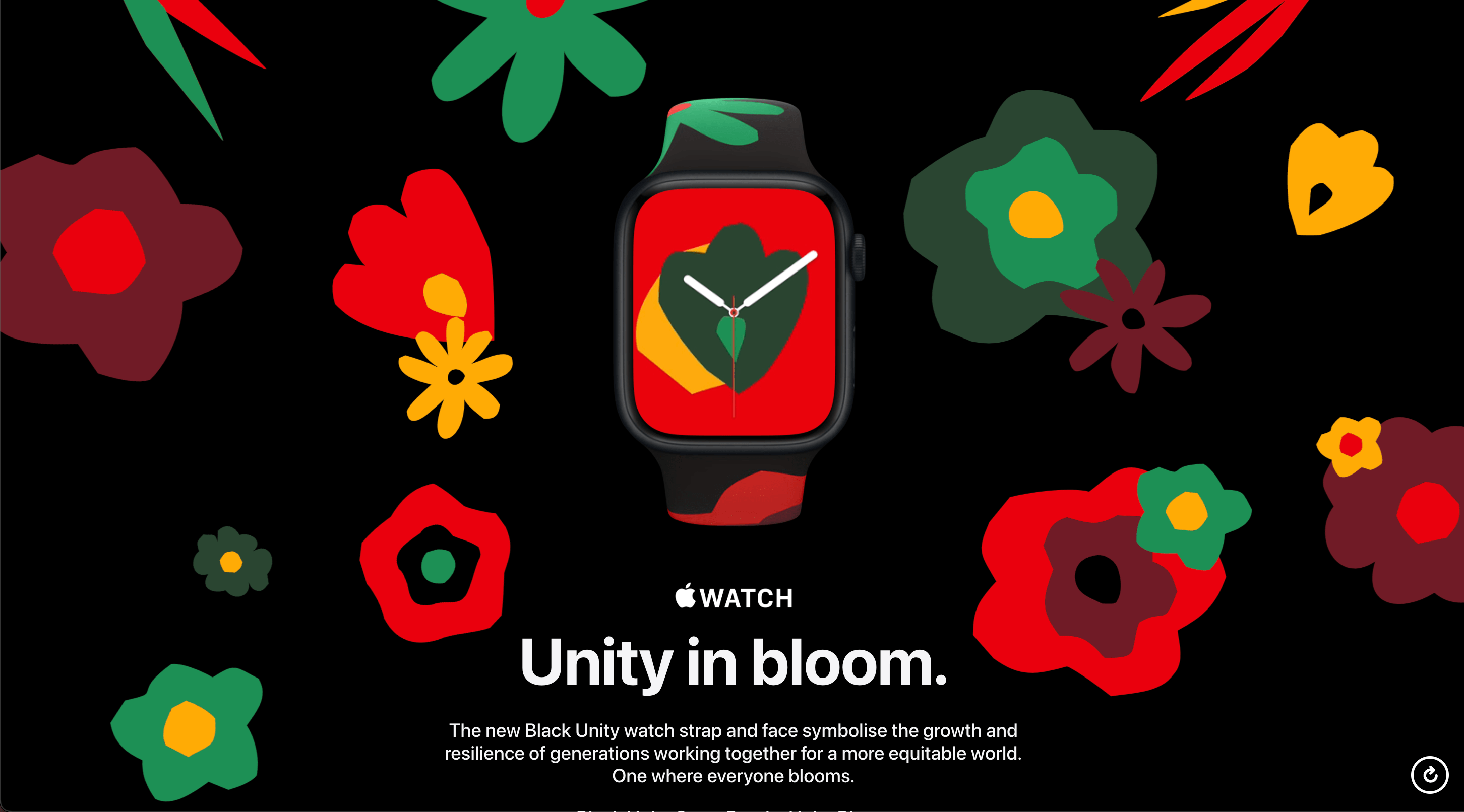
I was fascinated by the Unity Bloom theme wallpaper when I first saw it. I know it looks a bit casual in terms of drawing without putting much effort into it when you look at the details of the flower pattern. As you can see, the edge of it is a bit sharp and irregular and also looks like a geometric pattern. Honestly speaking, I prefer the smooth and elegant design. However, I still can't help but admire this wallpaper to some extent.
Plus, I'm kinda tired of the current solid-color wallpaper due to aesthetic fatigue. I've always wanted to add something to this component as a background or some decorative stuff and apply some dominant colors of each post to it. In the meantime, I noticed the extracting dominant color JS plugin that I'm using now can provide more than one color. So I feel like it's high time to bring those ideas together to make a brand-new design for the Author Card component.
H1Ideas
I plan to draw some SVG patterns by myself because I know there's a copyright so that I cannot use those SVG directly designed by Apple. More importantly, I can draw some elements that I like by myself or could be used as a symbol of me. Actually, there are lots of elements that I came up with, but I have to consider elements I will use that should look fine with most of the colors. For example, I like cheese to be used as an element but it seems doesn't go well with other colors except yellow or white. What's confusing is we can also make bold decisions when we are doing some artsy things. Who claims the sky always has to be blue?
Finally, after some brainstorming, I chose the daisy, the musical note, the olive leaf, the smiling face and the butterfly. Let me briefly introduce the reasons for my choice:
- Daisies: It means innocent love, peace, affection, kindness, sensitivity and purity.
- Musical Notes: Music is an essential part of my life. I want to share a few lyrics that just came to my mind when I'm writing. "Together we're a symphony. A perfect note in harmony." and "You sang a simple melody. A moment like an eternity.".
- Olive leaves: It is a symbol of peace and friendship dating back to ancient Greek mythology. Also, I think it gives me the impression of elegance.
- Smiling faces: "Live well, laugh often, love always" is one of the words that I like. Be positive in my life!
- Butterflies: Before I rebuilt my blog, it used the Hexo framework and Butterfly theme. What's more, butterflies have long been appreciated in Chinese culture as symbols of love, freedom, romance, and beauty. The image of butterflies lingering over flowers often suggests the felicitous union between a male and a female as women are often likened to blossoms.
H1Design SVG Patterns
For Daisies, I designed two different daisy patterns with 8 and 9 petals, which represent my birthday. I purposely designed it to be less symmetrical because I like the beauty of order out of chaos. Likewise, I drew 9 leaves on an olive branch pattern.
For Butterflies, I think they should be colorful with their wings, so I apply fill CSS property to give each part of the Butterfly's wing a different color.
The rest of the elements have nothing special to say.
H1Make it more unique and astonishing
If you also have experienced Unity Bloom wallpaper, you might have noticed the wallpaper changes every time when you reopen your iPhone. This suits my idea of designing one cover that can get multiple wallpapers. I want those wallpapers to look random but fit the palette of the current cover. It kinda sounds like you press several different keys on a piano, but they all belong to the same chord.
To implement this, I used Fisher-Yates shuffle algorithm to shuffle the positions of all the SVG patterns randomly.
tsx
for (let i = 0; i < insetArray.length - 1; i++) {
  const j = i + Math.floor(Math.random() * (insetArray.length - i));
  [insetArray[i], insetArray[j]] = [insetArray[j], insetArray[i]];
}
I plan to use 9 SVG patterns to decorate my Author Card. So that means I could have 9! (factorial) wallpapers, which is amazing to me. I could even spend an afternoon just looking at the wallpapers under different posts.
What's more, in order to make it look smoother and vibrant, I added several animations with different delays to those patterns as well.
H1Tools I used
I kinda worried whether what I did to the Author Card might cause distracting much attention of some readers. But I'm still on the way to level up my UI design and frontend development skills. At least this newly designed component gives me a sense of freshness and makes me very proud. Also, it would be great if it could give readers some inspiration!
Thanks for reading!
